Friday, 30 January 2015

Post modernism

Post modernism


Post modernism is the term that was used to describe the stylistic developments that emerged in response to the rationalism of modern design such as; Pop design, Anti-design, Radical design and all the movements that contributed to the emergence of post modernism. It is the most controversial movement that ever existed. Post modernism designers thought that modernism resulted in soulless objects, unwanted buildings and incomprehensible books.
They wanted to invent a new style which would break all the art rules that Modernists had established before. Post Modernists did not want to design simple objects, instead they wanted to create a style which would bring freedom to art and design through actions that often were funny.
Post modernists advocated individuality and mass production. Robert Venture wrote a book in 1966 saying that “Ambiguity and Contradiction Was Valid in Design” instead of rationality and logic. He argued that the lack of ornament was dehumanizing design. Architects such as Michael Graves introduced a new aesthetic by the mid 1970’s.


Portland building, 1982 by Michael Graves

Designers and architects argued that; Modern architecture was fundamentally meaningless. It lacked complexity and irony which prevailed in historical buildings. Post modernism NEW design was about the use of raw materials and using simple and formal visual language. It was very inexpensive, easily marketable, and good for mass production.  They didn’t want perfect products which looked like they were coming from a modernist era, they wanted to make objects look far from perfect. Some Post Modern designers included vibrant colours to the products to make them fun. Post Modernists were all about complexity and contradictive design which was a way of breaking every rule which Modernists made.
Martine Bedin (for Memphis), Super lamp prototype, 1981

Anti-thesis is what modernism stood for, if Modernists created good design Post Modernists tried to make chaotic design. Cheap materials were often combined with precious ones because they did not want to follow their rules and having everything the same way. The line between good and bad taste was blurred. They often made elaborate ornamentations mixed with minimalist form.


Bel Air Chair by Peter Shire

Charles Jencks, was an American critique. He advocated that products should be made of elements which are hybrid, rather than pure and messy. Vitality over obvious unity.


Garden of Cosmic Speculation, Dumfries, Scotland by Charles Jencks


Post-modernist designs looked at other historical styles for references such as art deco, de Stijl and constructivism. Other introduced eccentric elements in their designs…
The Memphis Group was a group which was funded in Milan in 1981. Their goal was to renew the Radical Design and to come up with a new creative approach to design.

The Group was made of;

-          Ettore Sottsass
-          Michele De Lucchi
-          Marco Zanini
-          Matteo Thun
-          Nathalie du Pasquier
-          George Sowden


Ettore Sottsass was an Austrian and he was designing with Olivetti and became a prominent member of the radical design movement during the 60’s and 70’s. The group’s aim was to renovate Radical Design. Memphis group added limited edition unusual products and functional design. The majority of the products featured laminated surfaces, bold patterns and bright colours.
Sottsass and the Memphis group were generating a political statement. They tried to eliminate the barrier between high class and low class. For some people this was a very strange thing but to others it offered freedom.
Ettore Sottsass have been described as a forward looking designer who also was a misbehaved artist.


Ettore Sottsass Carlton bookcase, 1981 by Memphis Italy

His bold and decorative designs which he produced in Memphis paved the way for the Post Modern designs. Sottsass called Memphis design the ‘New International Style’. He took the sophisticated and influential Milan design world into a labyrinth of visual irony. The Memphis group used lots of colours, materials and different forms. The standards of ‘good form’ design that had been considered unassailable for years lost their claim to. The idea they had in common was to eliminate the peaceful conformity of furniture design and to present concrete alternatives to the late 70s standard formal culture. The group existed until 1988.


This is an anti-war poster which has elements inspired from Post Modernism. It catches the eye with the controversial aspect in which it promotes love, delivering its message with weapons forming the ‘love’ word.

This is another example of Post Modernism design that is very controversial. I believe that the designer tried to deliver the message that those who have the most things in life don’t appreciate them.                                                                                                                                                   


References:
Failings in Architecture, Pt. 1 | DesignInquiry. 2014. Failings in Architecture, Pt. 1 | DesignInquiry. [ONLINE] Available at:http://designinquiry.net/contributions/failings-in-architecture-pt-1/. [Accessed 16 December 2014].
Vitra Miniatures Barcelona Chair - (Open Box): Floor Sample sale | Stardust. 2014. Vitra Miniatures Barcelona Chair - (Open Box): Floor Sample sale | Stardust. [ONLINE] Available at:http://www.stardust.com/barcelonachair.html. [Accessed 16 December 2014].

1980s Ettore Sottsass Carlton bookcase by Memphis Italy. 2014. 1980s Ettore Sottsass Carlton bookcase by Memphis Italy. [ONLINE] Available at:http://www.furniturefashion.com/1980s_ettore_sottsass_carlton_bookcase_by_memphis_italy/. [Accessed 16 December 2014].
Snail and Snake Mound, Charles Jencks, Garden of Cosmic Speculation, Dumfries, Scotland | AdorePics. 2015. Snail and Snake Mound, Charles Jencks, Garden of Cosmic Speculation, Dumfries, Scotland | AdorePics. [ONLINE] Available at: http://adorepics.com/snail-and-snake-mound-charles-jencks-garden-of-cosmic-speculation-dumfries-scotland/. [Accessed 14 January 2015].
Failings in Architecture, Pt. 1 | DesignInquiry. 2015. Failings in Architecture, Pt. 1 | DesignInquiry. [ONLINE] Available at:http://designinquiry.net/contributions/failings-in-architecture-pt-1/. [Accessed 14 January 2015].
 Bel Air Chair by Peter Shire - Chair Blog. 2015. Bel Air Chair by Peter Shire - Chair Blog. [ONLINE] Available at: http://www.chairblog.eu/2012/01/15/bel-air-chair-by-peter-shire/. [Accessed 19 January 2015].
Postmodernism - Victoria and Albert Museum. 2015. Postmodernism - Victoria and Albert Museum. [ONLINE] Available at:http://www.vam.ac.uk/content/articles/p/postmodernism/. [Accessed 19 January 2015].
Design Styles. 2015. Design Styles. [ONLINE] Available at:http://designstyless.blogspot.com/2010/06/this-anti-war-poster-uses-post-modern.html. [Accessed 19 January 2015].
Red Heads Are Bossy: November 2010. 2015. Red Heads Are Bossy: November 2010. [ONLINE] Available at:http://redheadsarebossy.blogspot.com/2010_11_01_archive.html. [Accessed 19 January 2015].


Anti Design

Anti Design

Anti Design is also known as Radical design. In the 1960s a flourishing number of avant-garde designers had started to rebel against the formal and elegance of modernism. Radical designers started to form in separate groups, such as Archizoom and Superstudio, which both were founded in Florence in 1966. These groups became the source of design, by building prototypes and organizing installations, while hosting events that showcased their concerns for the entire enviroment rather then the particular object.


By the following half of the decade, Ettore Sottsass held an exhibition of furniture in Milan, in 1966. Radical and Anti design had become a very important force in the world of design. Anti design rejected the formal values of the Italian neomodernism, and wanted to renew the political and cultural aspect of design, keeping in mind the original goals of modernism which had at that time, developed in a cheap marketing tool. In comparision, people who supported anti design wanted to sabotage "good taste" and exclusive esthetic values of modernism by applying all the design features it so angrily rejected. This movement supported briefness, irony, kitsch, strong colours and distortions of proportion to weaken thhe purely functional value of a product.

Arm Chair. Joe Colombo. Kartell.

Alessandro Mendini was the cheif spokesman which led the Milan-based Studio Alchimia, which was founded in 1976. Their aim was to advertise the change of everyday consumer goods into products of esthetic reflection. Ettore Sottsass Jr. was also part of this group and also; Paola Navone, Andrea Branzi and Michele de Lucchi. With Sottsass leading the group, individual activities were being carried out in singular groups, but that was till the Memphis collective was founded in the early 1980s.  As the Memphis group started to develop in Italy, the anti design, with its slogan saying "liberation of decoration for its own sake," grew into an internationally known style known as post modernism.


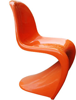
Panton Chair by Verner Panton


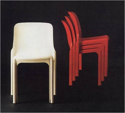
Vico Magistretti


References

Bhaskaran, L. (2005). Designs of the times. Mies: RotoVision.

Technology and Mid-Century Furniture Design in NYC for Fine Furniture Design | MOD Restoration. 2015. Technology and Mid-Century Furniture Design in NYC for Fine Furniture Design | MOD Restoration. [ONLINE] Available at: http://www.modrestoration.com/technology-and-mid-century-furniture-design. [Accessed 31 January 2015].


Arm Chair. Joe Colombo. Kartell. | Maestros del diseño | Pinterest. 2015.Arm Chair. Joe Colombo. Kartell. | Maestros del diseño | Pinterest. [ONLINE] Available at: https://www.pinterest.com/pin/985231143505350/. [Accessed 31 January 2015].

Anti Design. 2015. Anti Design. [ONLINE] Available at:http://antidesignn.blogspot.com/. [Accessed 31 January 2015].


Pop Art

Pop Art

The name Pop Art emerged from "popular art." The pop art movement developed firstly in England and America as a response to abstract painting, because pop artist thought that it was too mach elite and sophisticated. They favored using images of things that we use on our daily basis, like Andy Worhol Campbell's soup can and Roy Lichtenstein's comic strips. They used cartoon-like bulbous typefaces and fluorescent colours. Warhol manly made use of serigraphy, photo realistic, mass production and printmaking techniques, which were also the typical characteristics of the pop art movement.


Supporters of the pop movement were influenced by the mass consumerism and popular culture. They questioned the rules of good design. While rejecting modernism and the values they had, they replaced them with its own fun, variety, change, disrispect, and disposability.


Drawings were inspired from "low art" which advertised, packaging, televisions and comics. Artist like Andy Worhol and David Hockney, with their citation to mass culture, crossed over into interiors, wallpaper, posters and murals, starting a whole new world of fun in art and design.

image

The Independent Group was founded in London in 1952. It was the first group to dig and explore the growth of the popular culture that was happening in America. They've targeted a new type of design-concious young professionals. Designers all of a sudden realized that they needed a new juvenile and alternative approach to that advertised by the Good Design of the 1950s.

Terence Conranstated stated, "there was a strange moment around the  mid 1960s when people stopped needing and need changed to want...Designers became more important in producing 'want' products rather than 'need' products."

Product styling became socially obligatory, sustaining the throwaway society we have accepted as the norm. For most designers, plastic was the preferred material because they wanted to use bight and bold colours to attract the younger generations. Products were often of bad quality and very cheap, but disposability bacame part of the social aspect in a very short time, and also it became a part of the attraction, as the creator and consumer wanted non durable objects. The modernists would have shot them for doing such thing!


References

Bhaskaran, L. (2005). Designs of the times. Mies: RotoVision.

Saturday trip to see the pop art exhibition at the Barbican | Daisy Vasanthakumar. 2015. Saturday trip to see the pop art exhibition at the Barbican | Daisy Vasanthakumar. [ONLINE] Available at:https://daisyvgraphics.wordpress.com/2014/01/25/saturday-trip-to-see-the-pop-art-exhibition-at-the-barbican/. [Accessed 31 January 2015].


Barbican Blog — Pop Art Design - An Introduction. 2015. Barbican Blog — Pop Art Design - An Introduction. [ONLINE] Available at:http://barbicancentre.tumblr.com/post/61601990970/popartdesign. [Accessed 31 January 2015].


Contemporary Style

Contemporary Style

This is a style which refers to a movement which emerged in England after the World War 2. It is also known as Festival style, New English style and as South Bank style. Architecture, design and art were two major things in which this movement specialized in. The Britain Festival was what popularized this style, which was held in 1951. Promoters of this style used to combine organic shapes along bright colours in their work. They also exploited technology to attempt to make their work accessible as possible. Furniture that they were producing at that time was very light in weight and more vivid than furniture which had been made for modernism before the war. They were making use of pale timbers and thin metal rods. On textiles, upholstery and wallpaper prints of two dimensional patterns were being printed. Designers made 3D models which were representing the molecular structures in science labs to symbolize contemporary design

This style features softened and rounded lines. Interiors usually contain neutral elements and bold colours, while focusing more on the basics of lines, shapes and forms. Interior decorators normally use tone on tone colour palettes, focusing more on taupe, creams, browns and whites. Colours are sometimes painted on a single wall, in a stunning wall rug or in a special art piece.


Cozy And Contemporary Design In Apartment, The Matsuki Residence   Living Room

Furniture pieces are designed with clean lines and smooth surfaces without any decoration or designs on them, making use of slim outlines without being fragile. Normally materials are mostly light coloured wood, like beech, brich and maple, because the wood grain is very minimal. Clear glass, chrome, nickel and stainless steel are also used for furniture.


When it is a must to use fabrics, they need to be nice and very good materials, like linen, cotton, silk and wool. These materials are normally used for their textural features and natural hues. Geometric patterns and bold colors are also used in the designs and may be on pillows or rugs.


In lighting design is used to make an artistic statement in an interior which has a contemporary theme. Lights are used in various parts of the home to make it more comfortable and welcoming. Lights on floors and table lamps ae usually designed using simple straight lines and sleek shiny finishes. Lighting may be used to make a hierarchy for a wall hanging artowork or any other artwork which may be placed in ones home.


References

Bhaskaran, L. (2005). Designs of the times. Mies: RotoVision.
HGTV gives the details on contemporary decor | Interior Design Styles and Color Schemes for Home Decorating | HGTV. 2015. HGTV gives the details on contemporary decor | Interior Design Styles and Color Schemes for Home Decorating | HGTV. [ONLINE] Available at:http://www.hgtv.com/design/decorating/design-101/contemporary-style-101. [Accessed 31 January 2015].

contemporary lighting | Niche Modern Lighting - Part 9. 2015. contemporary lighting | Niche Modern Lighting - Part 9. [ONLINE] Available at:http://www.nichemodern.com/blog/tag/contemporary-lighting/page/9/. [Accessed 31 January 2015].

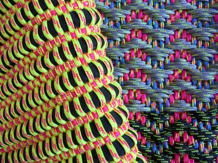
Angharad McLaren’s textiles | Yatzer. 2015. Angharad McLaren’s textiles | Yatzer. [ONLINE] Available at: http://www.yatzer.com/Angharad-McLaren-s-textiles. [Accessed 31 January 2015].


Modern Design of Contemporary Furniture, Decoration of the home - Home Ornaments. 2015. Modern Design of Contemporary Furniture, Decoration of the home - Home Ornaments. [ONLINE] Available at:http://homeornaments.com/contemporary-furniture/. [Accessed 31 January 2015].

Cozy and Contemporary Design in Apartment, The Matsuki Residence - Living room » Viahouse.Com. 2015. Cozy and Contemporary Design in Apartment, The Matsuki Residence - Living room » Viahouse.Com. [ONLINE] Available at: http://www.viahouse.com/2010/11/cozy-and-contemporary-design-in-apartment-the-matsuki-residence/cozy-and-contemporary-design-in-apartment-the-matsuki-residence-living-room/. [Accessed 31 January 2015].


scandinavian design

Scandinavian design

Scandinavian design is also referred to as Swedish modern and Danish modern. The name of this style is of a stylistic change that evolved through modernism in the 1930s. It is represented by blonde wood furniture with a definitive emphasis on line, shape and form. Objects often have bursts of colour, and some of them have fewer. Scandinavian design continues till this day as a very effective design for homes, both in Scandinavia and around the world.


Alvar Aalto - Arm Chair 406

Swedish modern

By 1900, Sweden, Denmark and Finland, each had refined their own style of art nouveau, and utilized for their traditional crafts areas of ceramics, glass, furniture, and textiles, which were all very popular in Scandinavia at that time. However it was Sweden, which created its own design style in the twentieth century.  An exhibithion which was held in Stockholm in 1930. There were a lot of architects that seemed to be distracted by harsher and more functional esthetic which were developed in Germany in the last years. Meanwhile the furniture designers were not easily distracted. They were commited to use natural materials like wood and leather. Bruno Mathsson, G. A. Berg, and Josef had started to rearrange the values, traditions and imagery linked with Swedish design.


Ant Chair - Arne Jacobsen

Danish modern
This nmovement had emerged a bit later in time. Danish modern was popular and visible in the world by the 1950s. This new Danish style had developed by means of Arne JAcobsen, Poul Kjaerholm and Verner Panton. They've created a sens of respect for natural materials , especially beech, brich and teak. At the same time they had created an interest in revived chair types, example, deck chairs, stick black chair and safari chair, which influenced the mass production of furniture produced at that time.


PK20 Chair - Poul Kjaerholm

Mogensen designed the African inspired chairs. They were made oyt of wood and leather. His younger colleague, Finn Juhl, desiugned expressive sculptured chairs designs during 1940s and 1950s. The aspects of the primitivism bacame a major characteristic of the Danish furniture design in the 1950s. The simple elegance of metal work by George Jensen was first seen at the turn of the century and was later continued with the work of Henning Koppel. One of the most amazing features of the Danish design at that time was the ability to make timeless products that looked fresh even in 50 years time.

Finnish modern

Finland didn't took stand as a leading movement in the world of contemporary design, until the 1951 and 1954's Milan Triennales. This happened thanks to the exclusive glass designs which were exhibited by Iittala. Iittala had held a competition in the 1950s which was won by Timo Sarpaneva ans Tapio Wirkkala, which they had never worked with glass before, but earned international reputations for the expressive, sculptural approach.


Glass dish - Tapio Wirkkala


Finnish approach to design was less committed to the traditional crafts fundamentals,unlike that of its neighbors, focusing more on world of contemporary design. However theplywood bent furniture which was designed by Alvar Aalto  shows craftsmanship. They were being produced even after the was as classic modern design pieces.


References

Bhaskaran, L. (2005). Designs of the times. Mies: RotoVision.
Kjaerholm :: Famous Furniture (EU) . 2015.Kjaerholm :: Famous Furniture (EU) . [ONLINE] Available at:http://famousfurniture.eu/home.php?cat=16. [Accessed 31 January 2015].

Trio of Arne Jacobsen Ant Chairs at 1stdibs. 2015. Trio of Arne Jacobsen Ant Chairs at 1stdibs. [ONLINE] Available at:https://www.1stdibs.com/furniture/seating/chairs/trio-arne-jacobsen-ant-chairs/id-f_786934/. [Accessed 31 January 2015].

Alvar Aalto Armchair 406. 2015. Alvar Aalto Armchair 406. [ONLINE] Available at: http://www.bonluxat.com/a/Alvar_Aalto_Armchair_406.html. [Accessed 31 January 2015].


Iittala Tapio Wirkkala glass dish - a photo on Flickriver. 2015. Iittala Tapio Wirkkala glass dish - a photo on Flickriver. [ONLINE] Available at:http://www.flickriver.com/photos/art-of-glass/3406811684/. [Accessed 31 January 2015].


Organic Design

Organic Design

Organic Design is a movement which emerged from organic architecture, which himself, Frank Lloyd Wright along with Charles Rennie Mackintosh developed this style in the late 19th century. Both had an ideology that the things surrounding us, such as furniture, should match esthetically and function well with both the surroundings of interiors and buildings as a whole. They also believed that buildings should show a relationship with their actual surroundings, could be in materials used, structure or colours.


Frank Lloyd Wright - Falling Water Interior


Glasgow School of Art - Charles Rennie Mackintosh

Although they took the approach of integrating with nature, it did not necessarily had to be shown esthetically, because at that time they were not used to organic forms and shapes very much. Organic design became what we refer to today, is when they introduced organicism to design by adding flowing ergonomic lines and curves.

Alvar Aalto was an architect and one of the founders of the organic design movement. His design philosophy was very essential for designers such as; Charles and Ray Eames in later years. Aalto throughly believed in using natural materials as a factor of addressing both, psychological and functional needs of the user. In 1940 an exhibition took place at the Museum of Modern Art (MoMA) in New York. It served also as a competition and was entitled; Organic Design for Home Furnishings, which was taken care by Eliot Fette Noyes. The goal for this exhibition was to showcase furniture and furnishings which the thought behind the design or materials was of an organic nature. This competition served to notice the ergonomically formed, molded plywood armchair by Charles Eames and Eero Saarinen. The armchair won the Seating for a Living Room Category. Saarinen's organic approach to design can be also seen in his architecture, in particular the TWA Terminal at New York's John F. Kennedy Airport.


Alvar Aalto - Villa Mairea


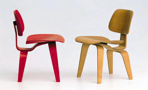
Charles and Ray Eames - DCW Chair


Pedestal Chair - Eero Saarinen


During the 1990s we saw a comeback of organic design at the opening of the London Design Museum's 1991 exhibition. New materials (especially plastics), new techniques of manufacturing, and advancements in computer generated designs, have all contributed to the formation of this style

Ross Lovegrove was one of the greatest advocates of organic design in the twenty first century. His style could be described as "organic essentialism." Lovegrove mixes ergonomic, almost sculptural forms made with state of the art materials and manufacturing processes. He constructed modern day masterpieces, like his "Go Chair" which was created from a high pressure, injection molded magnesium. He believed that the distinction of form that appears when a sensual organic relation occurs between an animate and an inanimate


Go Chair - Ross Lovegrove


References

Bhaskaran, L. (2005). Designs of the times. Mies: RotoVision.

 Glasgow School of Art: Fire crews save most of building « 1LOVE® ART – ART STORE – Urban Contemporary Art & Culture. 2015. Glasgow School of Art: Fire crews save most of building « 1LOVE® ART – ART STORE – Urban Contemporary Art & Culture. [ONLINE] Available at:http://1loveart.com/2014/05/glasgow-school-of-art-fire-crews-save-most-of-building/. [Accessed 30 January 2015].

Fallingwater | Home. 2015. Fallingwater | Home. [ONLINE] Available at:http://www.fallingwater.org/. [Accessed 30 January 2015].

ALVAR AALTO - Villa Mairea | We'll Take These Stairs | Pinterest. 2015.ALVAR AALTO - Villa Mairea | We'll Take These Stairs | Pinterest. [ONLINE] Available at: http://www.pinterest.com/pin/86272149082641506/?z=1. [Accessed 30 January 2015].

Vitra Miniature: Charles and Ray Eames DCW Chair Red | NOVA68 Modern Design. 2015. Vitra Miniature: Charles and Ray Eames DCW Chair Red | NOVA68 Modern Design. [ONLINE] Available at:http://www.nova68.com/2082.html. [Accessed 30 January 2015].

Nordic Heritage Museum: Contact Information. 2015. Nordic Heritage Museum: Contact Information. [ONLINE] Available at:https://www.nordicmuseum.org/exhibitions.aspx. [Accessed 30 January 2015].

Ross Lovegrove SUPERNATURAL chairs for Moroso — Shearyadi’s World. 2015. Ross Lovegrove SUPERNATURAL chairs for Moroso — Shearyadi’s World. [ONLINE] Available at:http://www.shearyadi.com/myworld/ross-lovegrove-supernatural-chairs-for-moroso/. [Accessed 30 January 2015].

Streamlining

Streamlining

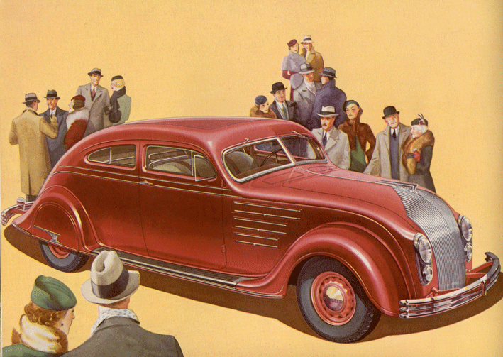
Streamlining is a style that emerged from Art Deco. From the 1930s through the 1950, Streamlining was the design movement which lead American design. They developed the style by simplifying and including a sense of dynamism which gave it a more commercial look. Streamlining had sustained the customer revolution that was happening during the 1950s and developed in to the visual language of the American modernity. This style consisted mostly in esthetics and economics. 

This movement was all about changing the shape and form of all objects so they could be more flowing and less resistant when they encounter certain elements as air or water. 

With this diagram below,one can understand exactly what the Streamlining designers believed in, and wanted to change. This diagram was drawn by the industrial designer Norman Bel Geddes. This diagram could also be found in his book; "Horizons" which was published in 1932. Their belief was that the teardrop shape would be much more efficient and beneficial to all human beings. Here it is showed how it is the most efficient shape because it lest air and water to slip over the object itself. 


The Chrysler Corporation was a car company that used to design aerodynamic cars. The first car which the company produced for commercial use, was the Chrysler 'Airflow' in 1934. The name of the car really reflects what the Streamlining movement was all about. They had designed the car with the aim of allowing air to pass over it. This car was designed by Carl Breer, who is more likely to be described as an engineer rather than a designer. 


Streamlining became an example of modernity for the American people. Products for consumers looked fresh. They had simple and clean silhouettes, gleaming industrial materials and sculptural casings. The style was recognized by speed lines and repeated horizontal lines which looked like an object trying to streak through space. During the time of streamlining there was a lot of new sales for consumer goods, especially electrical products. Streamlining was all about function. The movement helped us living the life we do. Moving objects were more functional than ever.


Ford Ka

Above we have an example of a streamlining design (could possibly be). This car has a bubble like shape. When you look at it, you can tell by the design that it is very aerodynamic. The spines that it has on the door through the back mud-guard helps a lot when the car is in motion. Today we come across several products that for us are normal things but we don't appreciate the true value of them.


References :


1934 Chrysler Airflow. 2015. 1934 Chrysler Airflow. [ONLINE] Available at:http://www.autolife.umd.umich.edu/Design/Gartman/D_Casestudy/Airflow.htm. [Accessed 30 January 2015].

Streamlined Design: Modernity in America . 2015. Streamlined Design: Modernity in America . [ONLINE] Available at:https://architecture.knoji.com/streamlined-design-modernity-in-america/. [Accessed 30 January 2015].


Ford Ka 1.2 69 hv Start/StopTitanium, Hatchback. Uusi auto, työsuhdeauto. Laske hinta, autoetu ja käyttöetu - Autotalli.com. 2015. Ford Ka 1.2 69 hv Start/StopTitanium, Hatchback. Uusi auto, työsuhdeauto. Laske hinta, autoetu ja käyttöetu - Autotalli.com. [ONLINE] Available at:http://www.autotalli.com/uusi-auto/58725/Ford/Ka/1.2%2069%20hv%20StartStopTitanium. [Accessed 30 January 2015].